Coordinate a villa’s chandeliers, pendants and wall lights by deciding which details should connect them and which differences should serve their positions. A shared metal tone, a related glass treatment or a similar quality of line can carry the scheme without repeating the same silhouette everywhere. Compare those choices in the room, then check their materials and switched-on appearance. The aim is a recognizable relationship that survives actual product selection, rather than a presentation of attractive pieces that happen to share a finish name.
Choose What the Fixtures Will Share
Chandeliers, pendants and wall lights can belong together through selected material, line or proportion relationships while retaining different forms. Choose a reference that is visible in the actual setting: the slender metal frame of a chandelier might connect to a pendant’s suspension and a wall light’s arm. Let the glass shapes differ if that suits the furniture and architecture. This is a proposed way to organize a selection, not a requirement to repeat every detail or use a single collection.
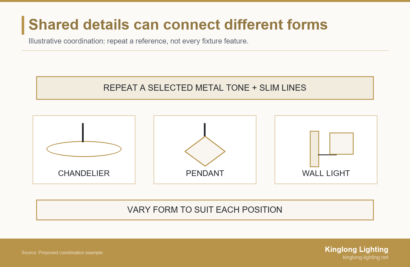
- Name the detail that should repeat, including the actual material or sample reference when available.
- State what may vary, such as shade shape, fixture category or decorative density.
- Check the relationship in shared room views and in the lighting conditions the occupants will use.
Start with the current plan, retained furniture, metalwork and material palette. The lighting specification and procurement resources can help organize those inputs before the fixture shortlist grows. Write a specific intention, such as “retain slender warm-metal lines, allow different shade forms.” A description like “all elegant” gives the next person little basis for choosing between candidates.
Compare Proportion and Line Weight in the Room
Compare each fitting with its own architecture and furniture as well as its neighbors. Line weight means how visually thick or dense the fitting’s lines appear. A small wall light with a solid backplate can look heavier in a view than an open chandelier with a much larger outline. Matching their diameters, arm counts or decorative density would not establish balance. Show the actual bodies, suspension and wall projection in coordinated drawings rather than enlarging isolated product photographs until they look equally important.
The Australian government’s YourHome lighting guidance relates lighting type and position to the room and activity. That supports keeping purpose in the selection discussion: a table pendant and a wall light beside a reading seat need not take the same form to belong together. This is an activity-based design principle, not an automatic transfer of Australian installation rules to a villa elsewhere.
Review repetition across the wall or ceiling as a whole. Several visible wall-light positions may create a stronger rhythm than the single product image suggests. Keep their relationship to doors, artwork and furniture in view. The appropriate response may be a quieter body or a different position, rather than making the chandelier more elaborate to compete.
Specify Metal Tone, Sheen and Surface Together
A finish name alone does not describe its full appearance. X-Rite’s explanation of material appearance identifies texture, gloss and transparency alongside color, and discusses the influence of illumination and viewing context. Use that distinction when comparing lighting finishes: “gold” is a starting description, not proof that different pieces will look alike. The source explains material appearance; it does not supply a matching tolerance for this villa.
Describe the intended metal tone and sheen separately. A warm satin reference and a highly polished yellow-gold surface may create a different relationship from the one intended, even if both suppliers use the same broad color word. Place identified samples beside the room’s handles, trims and furniture metalwork. Decide whether a difference should be reduced or retained as deliberate contrast. Do not confuse a warm-looking metal surface with the color temperature of the light it emits.
Kinglong Lighting’s catalogue provides named decorative families to consider. You can explore Kinglong’s decorative collections for candidates that carry the selected detail without assuming every category must use the same family. Confirm the actual finishes, sizes and possible adaptations for the enquiry. A collection name can organize the search, but the chosen products still need to fit the palette and their individual positions.
Carry a Glass Language Without Repeating Every Shade
A shared glass quality can connect different shade forms. The reference might be a restrained tint, a softly textured surface or an exposed edge detail, rather than an identical globe repeated on every fitting. Name the quality you want to carry through, then compare the actual glass, its transparency and its lit appearance. A pendant’s broad shade and a wall light’s narrow element may relate through that material choice while keeping very different outlines.
Also decide where glass should stop. A glass-rich chandelier may sit comfortably with a simpler shaded wall light if the metal lines connect them. Adding more glass to every secondary piece can remove the intended contrast. Conversely, an opaque shade may interrupt a scheme built around an airy, open appearance. Review that consequence in the relevant view rather than treating either transparency or opacity as universally preferable.
Ask to see the visible edges, fixing points and transitions between glass and metal. These details become part of the relationship at close range, especially beside seating or along a corridor. Keep the selected glass reference identifiable; a poetic description such as “soft sparkle” does not tell a supplier whether the important feature is the surface, tint or shape.
Check the Light as Well as the Unlit Fitting
Check source color separately from the metal palette. CCT means correlated color temperature and describes the apparent shade of white light. The US Department of Energy’s LED Basics guidance, from DOE, distinguishes light color appearance from color fidelity: how the light affects the appearance of objects. It also notes the information lost when light appearance is condensed to CCT. Matching CCT labels alone therefore do not establish that neighboring sources or illuminated materials will look the same.
The relationship may change when the lights are dimmed. In its guide to color-tunable LED products, DOE describes dim-to-warm products as becoming warmer in appearance as output falls. That is a particular product behavior, not a property of every dimmable light. A proposed pendant using it may diverge from a nearby wall light with a different source behavior. Ask about the actual source, driver and control arrangement before relying on the intended evening effect.
Record what needs to remain visually consistent and what may change between scenes. If the designer wants distinct pools of atmosphere, a difference can be intentional. If neighboring shades are meant to read as a calm pair, compare their actual behavior together. Changing a metal finish will not resolve a disagreement caused by the light source.
Review a Shared View With Identified Samples
Use the published decorative-lighting projects to discuss installed compositions, then return to this villa’s own views. Another installation can show how different forms occupy a space; it cannot approve the proposed products here. Assemble the chandelier, pendants and wall lights in the same drawing view, with furniture, nearby finishes and the intended observer position retained.
X-Rite’s introduction to lighting and visual evaluation explains that a product can look different under a different light source and highlights standardized viewing conditions. For a practical room review, keep comparisons consistent and label the samples being compared. Then look again under the relevant daytime and evening conditions. This is a design comparison, not a certified color-measurement procedure.
Compare the options at the same apparent scale and from the same viewpoint. Record the difference you actually see: a backplate looks too solid, a polished edge dominates, or a shade appears cooler than its neighbor. Change the candidate or the named detail that causes the conflict, then review the revised set. If a sample has not arrived, record that gap instead of writing “matched” beside a rendering.
Write a Coordination Rule Card That Allows Variation
Use the proposed coordination card to connect each fixture position with a carried reference, an allowed difference and a next check. The entries below illustrate how a team could record its design direction; they are not a documented client scheme or approved product specification. Replace them with the actual positions and sample references. Keep the card specific to the view being reviewed rather than applying one vague style label to the entire villa.
| Fixture and position | Carry through | Allow to differ | Check before selection |
|---|---|---|---|
| Illustrative dining chandelier | Proposed warm satin metal; slender visible lines | Open branching form over the table | Compare the actual finish reference and table view |
| Illustrative adjoining pendants | Related metal tone and suspension detail | Simple individual glass shades | Review glass tint and evening behavior beside the chandelier |
| Illustrative wall lights | Related metal and restrained arm detail | Compact shaded form | Check backplate density, wall projection and seated view |
| Your fixture / position: ______ | Reference to carry: ______ | Permitted difference: ______ | Missing input: ______; next check: ______ |
Read the completed row as a selection rule: retain the stated relationship, allow the stated variation, and resolve the stated check before treating the choice as settled. If a replacement is being considered, use the decorative-lighting value engineering guide to examine what changes in both design and quoted scope. A less expensive candidate is not equivalent merely because its finish description sounds similar.
Revise the Scheme When a Repeated Detail Becomes Too Strong
In an illustrative villa scheme, the designer chooses an open dining chandelier, simple glass pendants in the adjoining area and wall lights along the seating wall. The proposed connecting detail is warm satin metal with slender lines. Initially, the wall lights repeat a decorative motif from the chandelier. In the shared seated view, their broad backplates and dense detail look much heavier than expected. Repeating the motif has not preserved the intended lightness.
Use the wall-light row to identify what can change: the ornate body is not the protected reference; the metal relationship and restrained line are. Compare a simpler wall-light candidate in the same view while keeping the furniture and other fixtures unchanged. The revised composition can show whether the wall light now supports the intended material connection without repeating the chandelier’s entire gesture. Review its projection and useful light separately before selecting the product.
Now suppose the simpler candidate is shown only in a digital image and its finish sample is unavailable. The drawing may support the new form, but it does not settle the finish relationship. Leave that part of the card open and ask for a suitable physical reference or another candidate that can be reviewed. The result is a reasoned shortlist with a visible unresolved input, not a claim of final finish approval or a proven lighting outcome.
Give the Supplier a Defined Palette and Open Questions
Give the supplier the coordination card alongside actual fixture positions, relevant drawings and identified material references. Separate the details to retain from those that may vary. Include the retained pieces and any source or control requirements already set by the lighting designer. Ask product-specific questions: which finish sample represents this candidate, which wall projection is available, and which glass detail is shown? That is more actionable than asking for a whole-house set that is simply “similar.”
Keep the current drawing and sample references with the enquiry so a changed candidate can be reviewed against the same intention. Distinguish a visual direction from a purchase approval. The project’s appointed designers and technical parties still determine room suitability, installation coordination and the evidence needed for their own approvals.
To discuss the villa lighting brief with Kinglong, bring the floor plan, ceiling height, preferred mood and budget, plus the palette and coordination card. Kinglong Lighting’s published villa service requests those inputs and describes physical sample or detail review within its bespoke process. Confirm which product options and review materials are available for the actual enquiry. A useful next result is a clearer candidate and review scope, with the intended relationships and open questions visible.
Frequently Asked Questions
Can a retained chandelier work with new pendants and wall lights?
A retained chandelier can work with new pendants and wall lights when the new choices respond to its actual visible details and setting. Record its finish, glass, dimensions and relevant views before selecting additions. Choose a useful reference to continue rather than trying to recreate every aged surface or ornamental detail. Keep the retained piece’s condition and technical review separate from the visual pairing.
Should adjoining rooms always use the same fixture collection?
Adjoining rooms do not always need the same fixture collection; their relationship depends on which fittings are seen together and the intended design. A doorway may reveal only a small part of the next room, while an open-plan view exposes the whole combination. Coordinate that actual view. A more independent room can develop a distinct character without making every fixture in the villa unrelated.
What if the chosen finish is unavailable on the wall light?
Can paired wall lights match each other while the chandelier differs?
Paired wall lights can match each other while the chandelier differs, provided that the wider palette and actual wall composition connect them. A symmetrical wall arrangement may benefit from an identical pair, while the overhead piece uses a different form. Check the pair’s relationship to artwork, mirrors and the chandelier from the relevant view. Local symmetry does not require every fitting in the house to share the same design.